Row-columns-based layout
Before building our Flexbox layout, we revisit the traditional float-based grid layout. One of the easiest approach to implement grid is using the row-columns approach.
Time for Action—Build our own minimal float-based grid layout
At first, we define the following rules that prevents our layout broken by box-model or extra-large images.
/* Border box */
* {box-sizing: border-box;}

/* Prevent image breaking our layout */
img {max-width: 100%;}
Then we define the basic row-column properties that construct the foundation.
/* Grid: row */
.row {
  width: 100%;
  max-width: 600px;
  margin: 0 auto;
  padding-top: 10px;
  padding-bottom: 10px;
  overflow: auto;
}

/* Row within column within row */
.row .row {
  width: auto;
  max-width: none;
  margin: 0 -10px;
}

/* Grid: column */
.col {
  padding: 0 10px;
  float:left;
}
Mobile first design means that we work on the smallest layout first.
/* Dividing into columns */
@media screen  {
  .small-1 {
    width: 25%;
  }
  .small-2 {
    width: 50%;
  }
  .small-3 {
    width: 75%;
  }
  .small-4 {
    width: 100%;
  }
}
After the small layout, we define the medium which overrides the smaller layout configure if presented in the HTML.
@media screen and (min-width: 600px) {
  .medium-1 {
    width: 25%;
  }
  .medium-2 {
    width: 50%;
  }
  .medium-3 {
    width: 75%;
  }
  .medium-4 {
    width: 100%;
  }
}
Mobile first design
Mobile first means that during our website planning, we plan the content and layout for the mobile first. Planning for mobile first ensures us to consider the most important thing of our website. The screen is so tiny that we have to think clearly what’s important enough to earn a place there. And what is the most important thing that we put it on top of this tiny screen.
In grid system, mobile first means we use the small-* layout modifiers by default. When we need to build a wider layout, we start using the medium-*, large-* and even xlarge-*. Each one overrides the smaller one.
Using our grid system
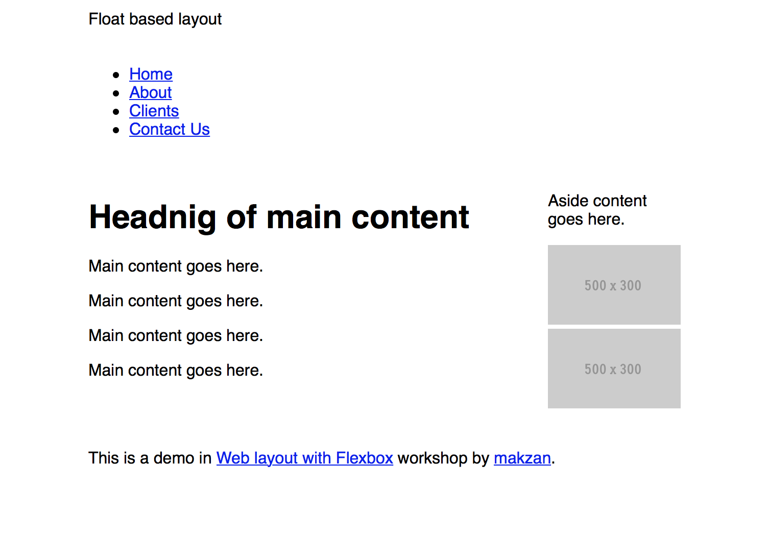
The following HTML is an example showing our grid system.
<div class="row">
  <div class="small-12 col">Float based layout</div>
</div>
<nav class="row">
  <div class="small-12 col">
    <ul>
      <li><a href="#">Home</a></li>
      <li><a href="#">About</a></li>
      <li><a href="#">Clients</a></li>
      <li><a href="#">Contact Us</a></li>
    </ul>
  </div>
</nav>
<div class="row">
  <main class="small-4 medium-3 col">
    <h1>Headnig of main content</h1>
    <p>Main content goes here.</p>
    <p>Main content goes here.</p>
    <p>Main content goes here.</p>
    <p>Main content goes here.</p>
  </main>
  <aside class="small-4 medium-1 col">
    <p>Aside content goes here.</p>
    <img src="http://placehold.it/500x300" alt="placeholder">
    <img src="http://placehold.it/500x300" alt="placeholder">
  </aside>
</div>
<footer>
  <div class="row">
    <div class="small-12 col">
      <p>This is a demo in <a href="http://flexbox.website">Web layout with Flexbox</a> workshop by <a href="http://makzan.net">makzan</a>.</p>
    </div>
  </div>
</footer>
When running the page in browser, we will see the following screens.